P Value
The Qustion
P-value is common in scientific researches, but it’s not often used in the practical data science. Why?
Concept
Let’s build the idea from a simple question.
A p-value is a “Surprise Index.”
Suppose there really is no effect or difference, such as a new drug working no better than a sugar pill. How often would we get a result at least as far from “no difference” as the one we found?
Low p-value (e.g., below 0.05): “If there were no effect, a result this extreme would be unusual. This is evidence against the ‘no effect’ assumption.”
High p-value (e.g., above 0.05): “This result doesn’t give me strong evidence against ‘no effect.’ But it doesn’t prove there is no effect, either.”
Key Takeaway
A p-value is NOT the probability that your theory is correct.
It answers a question that starts with “What if there were no effect?” That starting assumption is called the null hypothesis. The p-value tells us how often results at least as extreme as ours would occur under that assumption and the conditions required by the test.
From a Linear Coefficient to a P-value
Imagine plotting hours studied ($x$) against exam score ($y$), with one dot per student. Linear regression fits a straight line through those dots to describe the overall pattern.
The line has two adjustable parts: its starting height (intercept) and how much it rises for each extra hour studied (slope, also called a coefficient).
\[y_i = \beta_0 + \beta_1 x_i + \varepsilon_i\]The symbols describe that same idea:
- $i$ identifies one student; $x_i$ and $y_i$ are that student’s study hours and score.
- $\beta_0$ is the line’s starting height: the expected score at zero study hours.
- $\beta_1$ is the slope: the change in expected score for one extra hour.
- $\varepsilon_i$ is the student’s difference from that underlying line, because study hours don’t explain everything.
We don’t know the true slope. We estimate it from our students and write the estimate as $\hat{\beta}_1$. The little hat means “estimated from data.”
Our question is: could the slope we found be ordinary sampling variation, even if the true slope were zero? A zero slope means a flat line: no straight-line relationship between study hours and scores. This does not test whether studying causes a score change.
1. How uncertain is our slope?
If we sampled another group of students, we would probably get a slightly different slope. The standard error, or SE, estimates how much our fitted slope would vary across repeated samples of the same size. A smaller SE means a more precise estimate.
Two things help: points close to the line, and study hours spread over a wide range. If everyone’s study hours are almost identical, it is harder to work out how scores change with hours.
Here is how those two ingredients enter the formula for the usual best-fit line:
\[\operatorname{SE}(\hat{\beta}_1) = \frac{s}{\sqrt{\sum_{i=1}^{n}(x_i-\bar{x})^2}}, \qquad s = \sqrt{\frac{\sum_{i=1}^{n}(y_i-\hat{y}_i)^2}{n-2}}\]Let’s unpack it one piece at a time:
- $n$ is the number of students.
- $\hat{y}_i$ is the score predicted by our fitted line for student $i$.
- $y_i-\hat{y}_i$ is the vertical gap between a dot and the line. This gap is called a residual.
- $\bar{x}$ is the average study time, so $x_i-\bar{x}$ measures how far a student’s study time is from the average.
- $\sum$ means “add this up for all students.” Squaring the gaps keeps positive and negative gaps from cancelling; taking the square root returns to the original units.
The number $s$ summarizes how far the dots typically sit from the line. It is measured in score points. To calculate it, square each residual, add the results, divide by $n-2$, and take the square root. We will explain the minus two shortly.
The bottom of the SE formula summarizes the spread in study hours. So SE gets larger when the dots are noisier, and smaller when study hours are more spread out, keeping the other ingredient and the number of students fixed. Unlike $s$, the slope’s SE is measured in score points per hour.
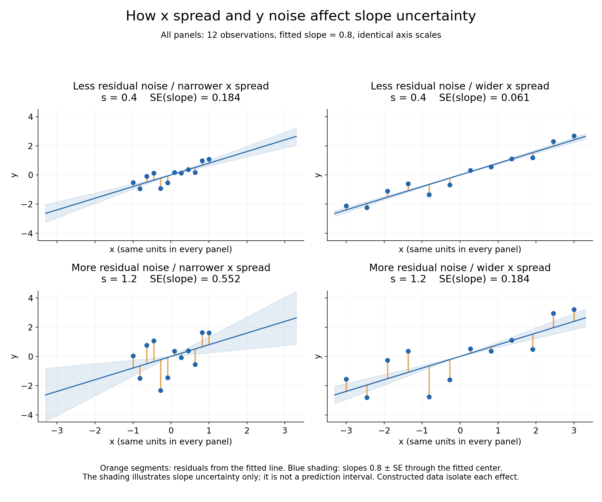
These plots use example numbers to make the comparison clear. All four have 12 dots and the same fitted slope of 0.8; only the spread and noise change.
- Look down a column: the orange gaps get three times larger. SE also becomes three times larger. More scatter makes the slope harder to pin down.
- Look across a row: the dots cover three times the horizontal range, with the same vertical noise. SE becomes one-third as large. A wider view makes the slope easier to pin down.
- Look at the blue shading: it shows lines with slopes one SE above and below the fitted slope. A wider opening means more uncertainty about the tilt. It does not show where future dots should fall.
What matters for $s$ is the distance from the line. Scores can cover a wide range and still sit very close to a steep line.
Also, collecting data across a wider range of study times is different from changing hours to minutes. Changing units changes the slope and its SE together; it does not give us more evidence.
2. How far is the slope from zero, compared with its uncertainty?
Divide the estimated slope by its SE. The result is called the t-statistic:
\[t_{\text{observed}} = \frac{\hat{\beta}_1 - 0}{\operatorname{SE}(\hat{\beta}_1)}\]For example, a slope of 0.5 with an SE of 0.2 gives $t=2.5$. Our estimate is 2.5 standard errors above zero. A slope of -0.5 with the same SE gives $t=-2.5$, equally far below zero.
A large distance from zero suggests stronger evidence, but how unusual is it? That is what the next step answers.
3. Turn that distance into a probability
Imagine repeatedly collecting 12 observations in a world where the true slope is zero. Each sample gives us a different fitted slope, SE, and t-statistic. Most t-values would be near zero; some would be farther away.
Student’s t-distribution is the curve that describes how often those different t-values would occur, under the conditions below. Its total area is 1, representing 100% of possible results. An area under part of the curve tells us the chance of a t-value falling in that range.
To use this curve exactly, the straight-line model must be appropriate. The errors must be independent of one another, follow a bell-shaped normal distribution around zero, and have the same amount of spread across $x$. If those conditions fail, the p-value from this calculation may be misleading.
We choose the curve using its degrees of freedom, abbreviated df. For this one-feature regression, that number is $n-2$: the number of observations minus the two line parameters we estimated, the starting height and slope. With 12 observations, we use $12-2=10$.
Why subtract two? Fitting the line uses some of the information in our data. Once we have chosen its height and slope to fit the dots, the leftover gaps are constrained by those choices. The $n-2$ adjustment accounts for this when estimating the noise. The t-curve also accounts for the fact that our noise estimate is uncertain. Smaller df values give more room for unusually large t-values.
For our question, a slope far below zero matters just as much as one far above it. So we count both ends of the curve, called its tails. This is a two-sided test.
\[p = P\!\left(|T| \geq |t_{\text{observed}}|\right) = 2\left[1-F_{t,n-2}\!\left(|t_{\text{observed}}|\right)\right]\]This formula says: add up the chance of a t-value at least as far from zero as ours, in either direction. Here, $P$ means probability, $T$ stands for a t-value from the curve, and the vertical bars mean “ignore the sign.”
The $F$ notation is just a way to look up the area to the left of a number on the chosen t-curve. Subtract that area from 1 to get the right tail, then multiply by 2 to include the matching left tail. Software or a statistics table provides this lookup; you do not need to calculate the curve by hand.
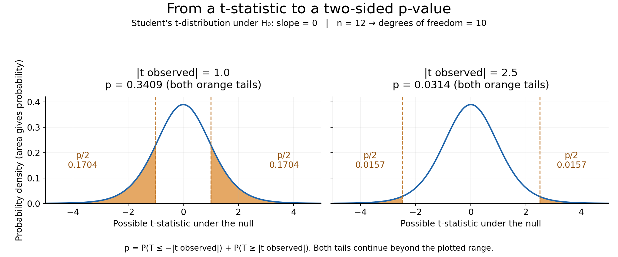
In the picture, the dashed lines mark our distance from zero in both directions. The combined orange area is the p-value. Read the area, not the height of the blue curve. When the dashed lines move farther out, less orange area remains, so the p-value gets smaller.
For example, suppose we have $n=12$ observations, an estimated slope of $0.5$, and an SE of $0.2$:
\[t_{\text{observed}} = \frac{0.5}{0.2}=2.5, \qquad \mathrm{df}=12-2=10\]On the t-distribution with 10 degrees of freedom, the area to the right of 2.5 is about 0.0157. The matching left tail below -2.5 has the same area:
\[p = P(T \leq -2.5)+P(T \geq 2.5) \approx 0.0157+0.0157=0.0314\]That is about 3.14%. If the true slope were zero and the test’s conditions held, about 3 in 100 repeated samples would give a t-value at least this far from zero. It does not mean there is a 3.14% chance that the true slope is zero.
This also explains why a large coefficient alone does not guarantee a small p-value. Compare these examples using the same degrees of freedom:
| Estimated coefficient | Standard error | Absolute t-statistic | What it tells us |
|---|---|---|---|
| 100 | 200 | 0.5 | A large coefficient, but weak evidence against zero |
| 0.1 | 0.01 | 10 | A small coefficient, but strong evidence against zero |
What matters is how far the coefficient is from zero compared with its uncertainty. A large but uncertain estimate can give weak evidence. A small but precise estimate can give strong evidence.
Finally, linear describes the straight-line model, not the p-value. Doubling a coefficient does not simply halve its p-value. P-values can also test other kinds of relationships. The particular model we used here fits a straight line, so it can miss a curved pattern.
Investigation
My first intuition of using p-value is in the feature selection of the ML model.
The short answer is: Yes, you can, but you must be very careful, and it’s often not the best tool for the job, especially for models like LightGBM.
TLDR;
Let’s break it down.
1. The Classic Use Case: Linear Models (like Linear Regression)
This is where p-values shine and where the technique originated.
When you fit a linear regression model, you are essentially trying to find the best coefficients (or weights) for each feature in a linear equation:
Target = C + (coeff_1 * feature_1) + (coeff_2 * feature_2) + ...
Statistical software (like Python’s statsmodels library) will run this regression and give you a summary that includes a p-value for each and every coefficient.
How to Interpret It:
- The “no effect” assumption here is: “This feature’s true coefficient is zero” (i.e., it has no linear relationship with the target).
- A low p-value (< 0.05) for
feature_1means: “It’s very surprising to see a coefficient this far from zero if the feature truly had no effect. We can reject the ‘no effect’ idea and conclude this feature has a statistically significant linear relationship with the target.” - A high p-value (> 0.05) for
feature_2means: “A coefficient of this size could easily happen by random chance. We don’t have enough evidence to say this feature is useful in our linear model.”
So, for linear regression, a traditional feature selection strategy is to remove features with high p-values. But a high p-value does not prove that a feature is useless, and repeated selection makes ordinary post-selection p-values unreliable. If the goal is prediction, check whether removing the feature improves validation performance.
2. The Big Problems and Caveats (Why it’s tricky for ML)
This is the most important part. Relying only on p-values for feature engineering in a general ML context can be misleading.
Problem 1: A coefficient test in a straight-line model can miss nonlinear relationships. A feature could have a powerful non-linear relationship with your target, but a linear model would completely miss it, giving it a high p-value.
- Example: Engine temperate vs. fuel efficiency. Efficiency is highest in the middle, and poor when it’s too cold or too hot (a U-shaped curve). A linear model would find no relationship, yielding a high p-value, and you might wrongly discard “engine temperature” as a feature.
Problem 2: P-values are irrelevant to Tree-Based Models (LightGBM, XGBoost). Models like LightGBM don’t work by finding linear coefficients. They work by repeatedly splitting the data on the features that best separate the target variable (e.g., reducing impurity or error).
- LightGBM doesn’t calculate p-values internally. It has its own method for measuring feature usefulness: Feature Importance. This tells you how often a feature was used to make a split and how much that split improved the model’s accuracy. This is a much more direct measure of a feature’s value to that specific model.
Problem 3: Multicollinearity messes up p-values.
If you have two highly correlated features (e.g., house_age and year_built), the linear model gets confused about how to assign credit. Both features might get a high p-value, suggesting they are useless, even though both are highly predictive.
Problem 4: Statistical Significance ≠ Predictive Power. With a huge dataset, a feature with a tiny, practically meaningless effect can still have a very low p-value. The p-value just says the effect is “not zero,” it doesn’t say the effect is large or important for making predictions.
3. Better Alternatives for Machine Learning Feature Selection
Instead of relying on p-values, ML practitioners typically use methods that directly measure a feature’s impact on predictive performance.
- Model-Based Feature Importance: (Best for LGBM, XGBoost, etc.)
- Train your LightGBM model on all the features.
- Then, simply look at the
lgbm_model.feature_importances_attribute. - This gives you a score for each feature based on how useful it was to the trained model. You can then discard features with zero or very low importance. This is the most common and effective method.
- Permutation Importance: (Model-agnostic and very powerful)
- Train a model and calculate its accuracy (e.g., on a validation set).
- Take one feature column and randomly shuffle it. This breaks any relationship it had with the target.
- Predict again with the shuffled data.
- The decrease in model accuracy tells you exactly how important that feature was. Repeat for all features.
- Recursive Feature Elimination (RFE):
- The model is trained on all features, and the least important one is removed. The process is repeated until the desired number of features is left. This is good for dealing with correlated features.
Summary
| Situation | Recommended Approach |
|---|---|
| Your model is Linear Regression and your goal is interpretation (understanding why). | Use p-values. It’s a great tool to understand which features have a statistically significant linear relationship with the target. |
| Your model is LightGBM, XGBoost, or Random Forest, and your goal is predictive accuracy. | Do NOT use p-values. Use built-in Feature Importance or Permutation Importance. These methods are directly tied to the model’s performance and respect its non-linear nature. |
| You are in the early exploratory data analysis (EDA) phase, before any modeling. | Using statistical tests (like ANOVA F-test or Chi-Squared, which produce p-values) to get a quick “first look” at relationships between individual features and the target can be a helpful pre-screening step. Just don’t let it be your final decision. |
Second Thought
I conclude that p-value is not appropriate for the feature selection of non-linear ML model.
Anything else we can utilize in the work? Below is the use-case I searched with sample codes.
Use Case 1: A/B Testing a Website Change
We test if a new green ‘Buy’ button (Group B) gets more conversions than the old blue button (Group A).
- Key Question: Is the observed difference in conversions real, or just random luck?
- Null Hypothesis (H₀): Button color has no effect on the conversion rate.
- Statistical Test: Chi-Squared Test (for comparing proportions of categorical data).
Python Implementation & Interpretation
import pandas as pd
from scipy import stats

# Step 1: Define our observed data in a contingency table
# Group A (Blue Button): 100 converted, 4900 did not
# Group B (Green Button): 125 converted, 4875 did not
observed_data = pd.DataFrame([
    [100, 4900], # Group A
    [125, 4875]  # Group B
], columns=['Converted', 'Did Not Convert'], index=['Group A', 'Group B'])

print("Observed Data:\n", observed_data)

# Step 2: Run the Chi-Squared test
# It returns the test statistic, p-value, degrees of freedom, and expected frequencies
chi2_stat, p_value, dof, expected = stats.chi2_contingency(observed_data)

print(f"\nP-Value: {p_value:.4f}")

# Step 3: Make a decision based on the p-value
alpha = 0.05
if p_value < alpha:
    print("Conclusion: Result is statistically significant. We reject the null hypothesis.")
    print("Business Action: The green button has a different conversion rate. Deploy the new button.")
else:
    print("Conclusion: Result is not significant. We fail to reject the null hypothesis.")
    print("Business Action: We can't prove a difference. Stick with the old button.")
Use Case 2: Comparing Customer Segments
We want to know if ‘Premium’ customers have a different average monthly spending than ‘Free’ customers.
- Key Question: Is the difference in average spending between the two groups statistically significant?
- Null Hypothesis (H₀): The average spending for both ‘Premium’ and ‘Free’ groups is the same.
- Statistical Test: Independent T-test (for comparing the means of two independent groups).
Python Implementation & Interpretation
import numpy as np
from scipy import stats

# Step 1: Create sample spending data for the two groups
premium_spending = np.array([55, 60, 45, 70, 80, 50, 65, 58, 62, 75])
free_spending    = np.array([30, 45, 50, 40, 35, 25, 40, 38, 42, 30])

print(f"Average Premium Spending: ${premium_spending.mean():.2f}")
print(f"Average Free Spending:    ${free_spending.mean():.2f}")

# Step 2: Run the Independent T-test
t_stat, p_value = stats.ttest_ind(premium_spending, free_spending)

print(f"\nP-Value: {p_value:.4f}")

# Step 3: Make a decision based on the p-value
alpha = 0.05
if p_value < alpha:
    print("Conclusion: Result is statistically significant. We reject the null hypothesis.")
    print("Business Action: Premium users spend a different amount. This justifies targeted pricing or marketing.")
else:
    print("Conclusion: Result is not significant. We fail to reject the null hypothesis.")
    print("Business Action: We can't prove a meaningful difference in spending exists.")
Use Case 3: Detecting Data Drift in a Production Model
An ML model was trained on user income data from 2021. We need to check if the income distribution of new users in 2023 has changed, as this could hurt model performance.
- Key Question: Is our model seeing data from a different distribution than it was trained on?
- Null Hypothesis (H₀): The new data comes from the same distribution as the training data.
- Statistical Test: Kolmogorov-Smirnov (K-S) Test (for checking if two samples are drawn from the same distribution).
Python Implementation & Interpretation
import numpy as np
from scipy import stats

# Step 1: Generate sample data representing income distributions
# Training data (2021): mean income of 50k
training_income = np.random.normal(loc=50000, scale=15000, size=1000)
# Live data (2023): let's assume mean income has drifted up to 55k
live_income = np.random.normal(loc=55000, scale=18000, size=1000)

print(f"Average Training Income: ${training_income.mean():,.2f}")
print(f"Average Live Income:     ${live_income.mean():,.2f}")

# Step 2: Run the K-S test
ks_stat, p_value = stats.ks_2samp(training_income, live_income)

print(f"\nP-Value: {p_value:.4f}")

# Step 3: Make a decision based on the p-value
alpha = 0.05
if p_value < alpha:
    print("Conclusion: Result is statistically significant. We reject the null hypothesis.")
    print("Business Action: Data drift detected! Alert the MLOps team; the model likely needs to be retrained.")
else:
    print("Conclusion: Result is not significant. We fail to reject the null hypothesis.")
    print("Business Action: No significant data drift detected. The model is stable for now.")